

Edition#4: Recovering from creative block, informative election maps
Edition#4: Recovering from creative block, informative election maps
Bounce-back to creativity, keep going, and alluring election maps

👊 How to unblock yourself from creative challenges
Creative blocks stand between us and the challenges we want to tackle. How to get over it has been a question on my mind for quite some time until I assembled a relatively straightforward playbook.
To remove it the first step is to understand what caused it. And here are a few possibilities:
feeling drained/burnout
severe self-critique/mental barriers
overthinking or lacking confidence
imagination lagging behind skills (able to build but don’t know what to build)
skills lagging behind imagination (have fantastic ideas but unable to realize them)
lack of focus
Depending on the causes, a few ways to handle it:
take a break
start small
squash the inner bogeyman - the fear that quelches our creative voices
observe the condition and environment when creativity occurs, and recreate that scene. Generation of ideas and the ability to execute them are the most important factors - even though society has some bias towards builders
code more, code better. Unless the technical skills to realize an idea grow in tandem with the creative vision, the vision is just an illusion
start anew in a different direction
📚 Recent Reads
This is a section I share about the books, papers, or blogs on viz, data science, and communication.
Keep Going: 10 Ways to Stay Creative in Good Times and Bad by Austin Kleon
This book generalizes well beyond art and could apply to many other fields where creative problem-solving is needed. Here are my notes.
Connection and disconnection
We need to connect to others to inspire each other, but also to take a break from the world to think and practice before one can share something worth sharing with others.
Be a verb and not a noun
Let go of what you’re trying to be (the noun) and focus on the actual work you need to be doing (the verb). You may not be able to get what you want or become who you want to be, but no one can stop you from doing what it entails.
Don’t be too hard on yourself
I find this quote incredibly considerate:
“You are not responsible for the world - you are only responsible for your work - so do it” – Sol LeWitt to artist friend Eva Hesse
Pay attention to what you pay attention to
Understand how you are spending time because the things you pay attention to defines you.
Subvert the subversive
And finally, this quote, which is so apt for 2020💜 :
“I know the world is bruised and bleeding - while it's important not to ignore its pain, it is also critical to refuse to succumb to its malevolence.”
Creative Block: Get Unstuck, Discover New Ideas. Advice & Projects from 50 Successful Artists by Danielle Krysa
This book generalizes less well beyond the creative field, but it’s highly actionable and practical (for artists), with a list of 50 art projects (some only require common daily objects, others require no material at all) to unwind your mind.
🔦 Kaleidoscope
This is an ad-hoc section on curious finds. This week I will bring you on a tour of different types of election maps for the recently concluded U.S. election, categorized by 1) whether they use a map, 2) use only the layout of a map, or 3) deal away with maps altogether.
On the map
While the choropleth map is the most common, the size of the state can be distorting – bigger areas could appear to have a bigger weight which is not the case. The visualizations from lemonde.fr and Financial Times chose to overlay waffle chart or packed dots on top of a geographical map to show electoral votes.

The benefit over choropleth is that it’s easier to see the quantities, and the benefit over cartograms is gained through preserving our familiarity with the usual geographical map. Here is a write up from FT on how they came to an alternative to choropleth and cartogram.
In addition to maps showing the net outcome, the NYT uses an arrow map and the Washington Post uses a wind map (both behind paywall) to visualize changes.
Not on the map
Instead of showing the state borders, the very interesting area chart map and treemap map below only use the relative positions of state and dealt away with the underlying map. When the chart form is squarish, the underlying map doesn’t seem to be necessary anymore.

Not on the map altogether
There are yet other topics that do not necessarily rely on the geographical representation of a map.
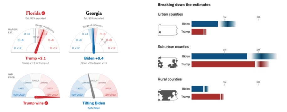
One example is visualizing uncertainty, such as the NYT needle and WaPo’s fuzzy bars. Another use case is visualizing decision paths, such as this 2012 classic.
Bloomberg’s live snail chart combines a line chart and a bubble chart (or rather, a half-moon). The line shows % voter turn out and the timeline of color flipping in some states, while the bubbles show lead margins.

In a map version, WaPo’s peak chart visualized similar stats (total votes cast and margin) with a very different visual encoding - height & width of peaks, while landslide wins are shown with thick stroke and all peaks are overlayed on a choropleth map - combining aggregate and details.
While the version on the right showed more granular details at different levels in a snapshot, the first one captured a time component and is more suited for live updates.
Other map collections
We design maps for a living. Here’s who got the 2020 election right by Stamen Design
Live coding election night visualization by EJ Fox & Ian Johnson
A recap of 2016 election maps by Andy Kirk
