

Edition#5 Why & how to prototype in data science, participatory viz
Edition#5 Why & how to prototype in data science, participatory viz
Prototyping recipe, chartified self, participate in data

Welcome to the 5th edition of Cross Sections 🎊- a newsletter covering personal reflections and curated content on data science, data viz & communication.
🖇 Why & how to prototype in data science
🌪️When do you need to prototype
Prototyping can help us visualize the end state for data science/machine learning projects. It helps validate what’s useful to build before spending a lot of time building it. It translates what’s in our mind to concrete things before our stakeholders’ eyes. Perhaps most important of all, it prevents Type III error - solving the wrong problem.
Here are some example scenarios where you might consider building a prototype:
if your work intersects with product
if you need feedback on the deliverable that cannot be achieved via sharing a python notebook or R markdown. For example, with a prototype, you can demonstrate the output on a user-uploaded dataset, image, or article
if the usefulness of your model can be amplified with an interactive app.
If you’ve decided you need a prototype to start a dialog or influence your stakeholder, you’ll need a tool. Which tools to use depends on the stage of the project, the goal you want to achieve.
🧩Which prototype to build
In general, there are two types of prototypes once you’ve established the core of what you want to build:
low-fidelity prototypes: you want to communicate the idea, the prototype might not be functional, typically very quick to build
high-fidelity: you want to test out intricate interactions and showcase detailed functionality, could take some time but typically less time than what a full-fledged product would take
And they require different tools.
🔨 Which tool to use
I made this flow chart on deciding which tool to use based on some of the best tools that are also not too complicated to use.

Please feel free to reply or comment if you know other good tools!
📚 Recent Reads
This is a section I share about the books, papers, or blogs on data visualization, data science, or communication.
Am I overthinking this? by Michelle rial
This quick read is hand-drawn diagrams meet quantified-self. The author set out to write a ‘coffee-table book that is not used as a coaster’, and declared this ‘not a book of charts’ but ‘a book of questions’.
The author reappropriated daily objects to create those charts. Examples of materials used:
* coffee cup stain Venn chart
* cocktail umbrella Pie chart
* Chinese take-out box Funnel chart
* and Tree diagram made of real branches.
It reminds me of similar projects using simple & clear diagrams to illustrate things, such as this book on culture from over a decade ago: East Meets West by Yang Liu.
Delivering Happiness by Tony Hsieh
A few months back I was thinking about the sometimes unaligned objectives of profit and company culture in society at large. An entrepreneur recommended this book as a philosophy to currently optimizing profit and culture. I genuinely liked the book and would highly recommend it. Some traits of its positive influence on Airbnb culture only became clear to me after I read this book.
🔦 Kaleidoscope
This is an ad-hoc section on curious finds. This week we take a look at an emerging subgenre of data viz I’m particularly interested in - participatory visualization.
When we create a visualization, we are (or at least may seek to be) experience providers instead of code renderer or pixel pushers. A data experience would allow the thinking part of the brain to communicate with the feeling part of it.
This public data physicalization project Chemicals in the Creek by Laura J.P. et al creates a ‘ceremony’ by using LED lanterns floating on a creak to visualize chemical pollution in a performative manner. They aim to bring forth values of data visualization such as ‘affective’ and ‘social’. The main difference from other data physicalization project is perhaps this performative and interactive attribute.
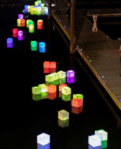
It got me thinking about the difference between interaction and participation. Interaction requires one to take some actions, which can be done independently, while participation requires one to be immersed or present in a certain context, often as part of a group and in public. It’d be super interesting to see if one day data viz can be part of various public art projects such as light festivals or sculpture parks, which could bring forth more participatory data experience.
Another data physicalization project which user could also interact with is Transparent Data by data artist Laurie Frick, who used movable colored glass pieces to show the department and growths of a university.

