Edition#6: How to structure narratives in data; physicalization as viz
Edition#6: How to structure narratives in data; physicalization as viz
Narratives informed by psychology, predictable irrationality and physicality of data

🖇 Structuring narratives in data with Gestalt principles
Structuring narratives is a useful soft skill in data science, and despite all the new techs, still vital for organizations. Yet the notion of a narrative is both abstract and broad. I’m just gonna focus on a tiny piece of it - coherence.
A technique for developing coherence in data visualization is the Gestalt principles from psychology - i.e. by putting similar items together, and enclosing groups of elements by their categories, one makes the charts easier to perceive, illustrates continuity, and subsequently ease the information flow.

This isn’t only for chart elements such as shapes (bars, lines, dots), but can be applied on other encodings and on a meta level too. For example, one can use similar, contrasting, or groups of adjacent colors to encode relevant information. One can also use similar, contrasting, or groups of charts for a narrative. A small yet fundamental trick in the communication toolkits.
📚 Recent Reads
This is a section I share about the books, papers, or blogs on data visualization, data science, or communication. This time I decided to make some diagrams to illustrate what the book is about.
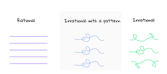
Predictably irrational by Dan Ariely
This is a book on behavioral economics – biases and heuristics that affect people’s decisions. I read this book because we simply couldn’t ignore the presence of irrationality or assume everyone will react with logic.
I find that premise interesting, as it carves out a small area between the dichotomy of rationality and irrationality, and focus on those recurring irrational behaviors with a pattern.
Through experiments, it illustrated 10 observations such as the endowment effect (people overvalue things they own):

and procrastination (and how to alleviate it using penalties as motivators):

It is written over a decade ago though. I’d be interested to know some new-age explainable irrationality today, and if any of the collective behaviors have shifted across time.
🔦 Kaleidoscope
This is an ad-hoc section on curious finds. This week we will look into data physicalization.
Representing data using physical items feels like a trend from the not-too-distant past. Yet people of Mesopotamia had been doing it before written languages existed – they used neolithic clay tokens to represent quantities of goods.
Fast-forward 7000 years, these clay pieces are now in Louvre Museum. Safe to say these folks had persisted their data well.

People nowadays are using other tools and mediums to illustrate data. These mediums give way to new forms of visual encoding based on attributes such as texture and 3D spatiality. Here are some of the examples.
Knit
Temperature scarves is a project by Kristen Cooper Nutbrown to visualize global warming. It made an important agenda easy to digest, though the only concern is how to wear it in the right direction.

Kinetic sculpture
Pinwheels is a project by Tangible Media Lab that envisions the space we inhabit (rather than a computer screen) as the interface between data and us. It uses motions of pinwheels to represent email traffic.

Acrylic/Plastic
Touching Air is a project by Stefanie Posavec and Miriam Quick which use necklaces to visualize air pollution.

Happiness X GDP is a project by Jang Lee that visualizes global happiness data in the form of earrings.

Edible
Not a Single Origin is a project by an Australian viz consultancy which represents the origins of 12 Sydney suburbs based on population census data, using different chocolate flavors (i.e. Balsamic/Orelys for Italian, Baileys/coffee for Irish, etc). Worth taking a look (I mean, a bite).

Referenced materials
Opportunities and Challenges for Data Physicalization
Pinwheels: visualizing information flow in an architectural space