

Edition#7: The zen of visualization, computational creativity events
Edition#7: The zen of visualization, computational creativity events
Open and closed form visual structure, books on misinformation & experimentation

🖇 The zen of visualization
Much like we need a delicate balance in our daily life. So does viz. Being aware of those could prevent us from veering onto the wrong path. Here are some factors one would often encounter.
Simplicity vs complexity
While people often prefer clarity, which sometimes read as simplicity, certain datasets require complexity. A two-column time series can be illustrated with a simple line chart (unless you are in journalism, then it could be an interactive game, a winding illustration, 3D rollercoaster, among other things), whereas a high-dimensional large-scale dataset would need more visual scaffolding to unroll its hidden patterns.
But besides data representation and cognitive load, there are other concerns. Conformity vs novelty influence the form of visuals. Bar charts, line charts, and pie charts have long been the most popular chart types, but they are also the most déjà vu. Novel chart forms are constantly being invented. Some stay niche, others eventually move to mainstreams, such as parallel coordinates – usually won’t make an appearance in a corporate dashboard, yet a regular on many ML experimentation tracking and observability platforms.
Sometimes the intrigue of the topic or the appeal of aesthetics may warrant some complexity until it becomes overkill.
I'd like to think of complexity as intentful - an action which one could justify:
it's complex because the data demand so
it's complex yet with proper explanation and annotation it's not elusive
it's complex in general but not so much to specialists of the domain
it's complex because otherwise, it won't have the same impact
Could complexity merge back into simplicity like a serpent eating its own tail? Possibly. The author of Atomic Habits, James Clear, stated it this way:
Beginner = ignorant simplicity
Intermediate = functional complexity
Advanced = profound simplicity
While I liked how they sound, and found them generically true, no rule always holds for viz.
I've started to view simplicity as what resonated with the viewer. If a viewer is willing to open up to the viz, complexity may not be an issue. If a viewer isn't interested, simplicity won't help. All is relative, determined by the specific groups.
And for those who could distill crucial information and reach profound simplicity, they face the next choice:
Closed-form vs open-form
Is the viz supposed to be a monologue or a dialog? Different contexts demand different viz structures. Some are exploratory - the great unknown awaits who toggles the filters. Some are explanatory, the creator may wish to serve a dish of facts. Some might be sensory, if you purely approach it from a logical point of view, you might not be able to make sense of it.
In terms of deciding on the content, one way is to ask not what you can show to the viewer, ask what the viewers need to see. In deciding the structure, one also considers their modality of consumption – Who is your audience and how do you want to interact with them. Then it comes to balancing between your best judgments and viewers' needs and habits.
To decide how open-formed the viz is - overview, details, or everything in-between, we are also deciding how much interaction is necessary. Will you users care to click around, will they need to understand the cause-and-effect, is knowing the rationale for the conclusion crucial for establishing trust, will your users misinterpret things when given too many details, or perhaps too few?
Recap
In short, Oversimplification may hide important details, while senseless complications can lead to obfuscation, while all is relative. One also considers other factors such as how open-formed the viz needs to be. The points of balance in viz probably extend well beyond these.
📚 Recent Reads
This is a section I share about the books, papers, or blogs on data visualization, data science, or communication. This time I decided to make some diagrams to illustrate what the book is about.
How Charts Lie by Alberto Cairo
The reason to read this book is to discern and retain the factfulness of charts, such that we make sound decisions in our daily lives and avoid spreading misinformation. The book explains how factors such as too little data, too much data, wrong data, and wrong scaffolding of charts could each lead to inaccurate visual communication.
Something I learned from this book is when to deviate from the rules.
For example, it’s often imperative to start the y-axis from zero to avoid distortion, yet one exception would be visualizing global warming. Here a couple of degrees increase could have drastic ecological implications, yet on a chart with 0 as the baseline, the trend would be flat, giving the contrary message that all is fine. We would actually observe many of the charts using the temperature of a certain year (1880) as the baseline, and use the differences in the following years to visualize anomaly.
Experimentation Works by Stefan H.Thomke
This book covers case studies on how businesses benefit from autonomous & scalable experimentation platform that enables everyone to make decisions based on scientific methods, as well as myths about experimentation culture. It also touches on how to present counter-intuitive outcomes.
🎥 ICYMI
This is an ad-hoc section on events related to code, art, ML.
Art+code homemade took place this mid-Jan, focusing on interactive/computational media and creative practices. The recordings can be found on its site.
Among the few I watched:
Andy Quitmeyer reflected on the relation between humans and tools, and how his team shrank an entire maker studio from a sailboat to a carryable backpack, and to wearables, such that field biologists can be more nimble.
Laura Devendorf showcased her exoskeleton project which merges digital weaving and electronics to elicit responses to the friction in her daily life
Cyril Diagne shared his effective weekly sprint process and his projects at the intersection of UI and Computer Vision, seeking a deeper connection with artworks.
NeurIPS workshop on creativity and design happened last month, covering visual art, music generation, text, and research on AI art. All the videos can be found here. I really like the sessions. A few artworks I found rather unique are:
Artificial remnants, a generative project by Sofia Crespo and Dark fractures that creates images and descriptions of imaginary insect species based on 3D GAN.
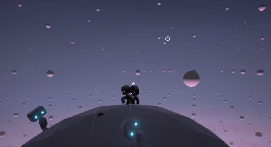
Agence, a short movie telling the story of how reinforcement agents placed on a tiny planet interact with each other, augmented with music and cinematography.

Image credit: agence by Dante Camarena

Thanks for reading. As the new year unfolds, there are many things to be grateful for, among which, I’m grateful for the fact that you are among the first group of people who subscribed to this newsletter. See you in the next edition 😎